> ## Documentation Index
> Fetch the complete documentation index at: https://docs.explo.co/llms.txt
> Use this file to discover all available pages before exploring further.
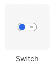
# Switch
> Switches allow your customers to be able to move between two configured states of your dashboard.
 ## What it does
This component allows you to configure your dashboard so your customer can shift
between two different states.
## Configuration
## What it does
This component allows you to configure your dashboard so your customer can shift
between two different states.
## Configuration
 ### Basic Configuration
| Configuration Option | Description |
| --------------------------- | --------------------------------------------------------------------------------------------------------------------------------------------------------------------------------------------------------------------- |
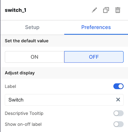
| Label | The is the label that appears on the left side of the switch. It defaults to "Switch". The toggle allows you to choose whether or not to display this label. |
| Descriptive Tooltip | This can be configured to display a helpful popover to the customer. The toggle allows you to choose whether or not to display the tooltip. |
| On/Off Label | This is the label that appears on the right side of the switch, and it denotes the status of the switch. The toggle allows you to choose whether or not to display this label. |
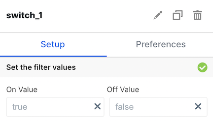
| On/Off Value | This allows you to configure the value of the corresponding variable for this element. The default values are `true` for On and `false` for Off. |
| Set Default Value | Specify if default should be on or off |
| Enable Dependency Selection | When enabled, you may create a dependency between this element and other elements on the dashboard. When this element is dependent on an element selected, it will be disabled until a value is selected by the user. |
## Variable Usage
In the SQL query, use the following syntax
```sql theme={null}
--- basic usage:
WHERE 1=1
[[AND column_1 = {{switch1}}]]
--- filter a chart based on a column if switch is on, do nothing if switch is off
WHERE [[(({{switch1}} = 'true' AND column_1 = true) OR ({{switch1}} = 'false'))]]
```
## Filtering
You can now filter directly your charts in the UI elements themselves. For more information on this process, see the [filtering section of the overview page](/creating-dashboards/ui-elements#filtering).
### Basic Configuration
| Configuration Option | Description |
| --------------------------- | --------------------------------------------------------------------------------------------------------------------------------------------------------------------------------------------------------------------- |
| Label | The is the label that appears on the left side of the switch. It defaults to "Switch". The toggle allows you to choose whether or not to display this label. |
| Descriptive Tooltip | This can be configured to display a helpful popover to the customer. The toggle allows you to choose whether or not to display the tooltip. |
| On/Off Label | This is the label that appears on the right side of the switch, and it denotes the status of the switch. The toggle allows you to choose whether or not to display this label. |
| On/Off Value | This allows you to configure the value of the corresponding variable for this element. The default values are `true` for On and `false` for Off. |
| Set Default Value | Specify if default should be on or off |
| Enable Dependency Selection | When enabled, you may create a dependency between this element and other elements on the dashboard. When this element is dependent on an element selected, it will be disabled until a value is selected by the user. |
## Variable Usage
In the SQL query, use the following syntax
```sql theme={null}
--- basic usage:
WHERE 1=1
[[AND column_1 = {{switch1}}]]
--- filter a chart based on a column if switch is on, do nothing if switch is off
WHERE [[(({{switch1}} = 'true' AND column_1 = true) OR ({{switch1}} = 'false'))]]
```
## Filtering
You can now filter directly your charts in the UI elements themselves. For more information on this process, see the [filtering section of the overview page](/creating-dashboards/ui-elements#filtering).