How to Set Category Colors Up

In the top left corner of a dashboard page, the caret dropdown will open up a dropdown with a few different settings, including the ability to set color categories. Click “Set color categories”.

A modal will pop up, giving you the ability to add defined values or column names and their corresponding colors.

There are two ways to set up colors.

Values: You can set colors based on the underlying values you see in the dataset (not any formatted values)

Set the color by the value name in the “Sync color categories” modal:

Now, the data grouped by the value “Shared room” matches the light blue color specified at the dashboard level where the other columns use the chart’s set color palette:

Columns: You can set colors based on column names as identified by each y-axis column’s data label.

Set the color by its data label name in the “Sync color categories” modal:

Now, the column with the data label “Average Price” matches the light green color specified at the dashboard level where the other columns use the chart’s set color palette:

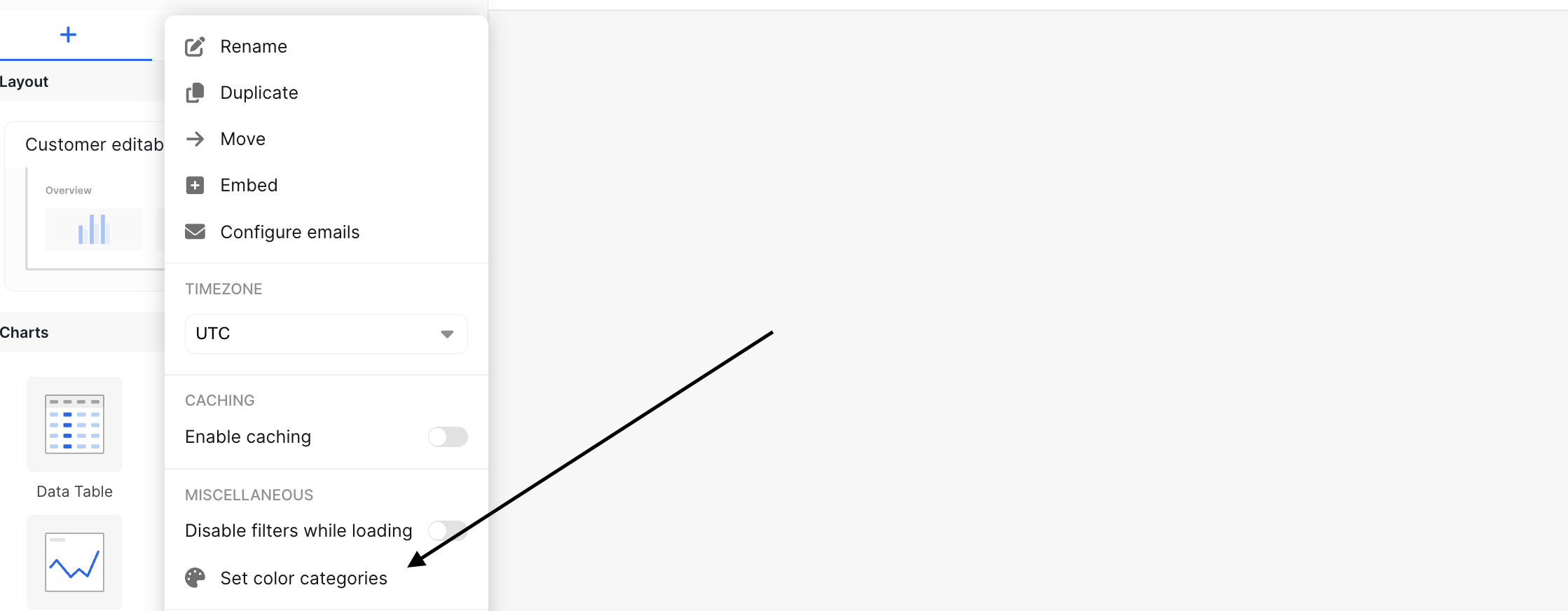
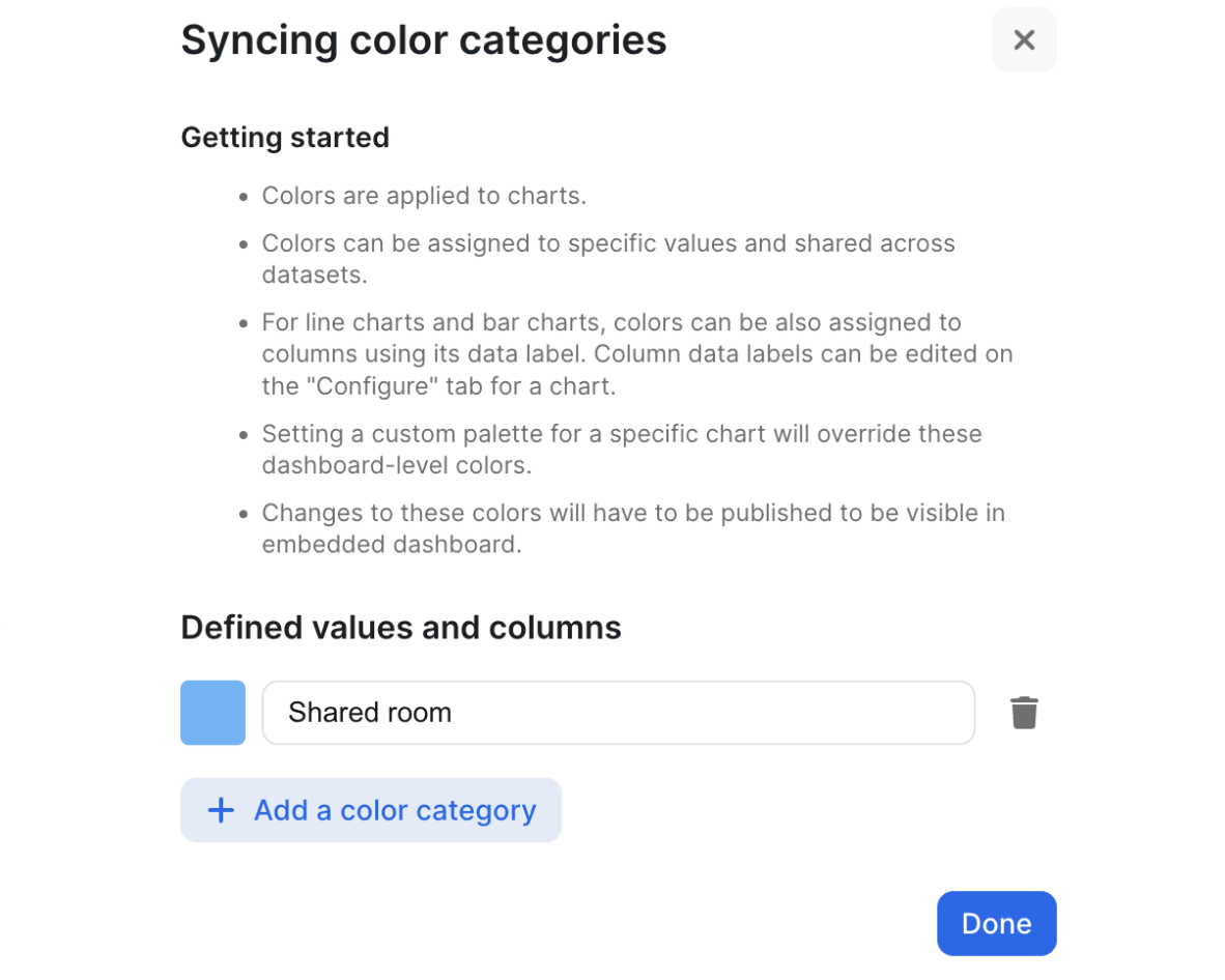
General Feature Callouts

  • A chart using a custom color palette will override these color selections.
  • Column colors can only be set for line charts and bar charts.