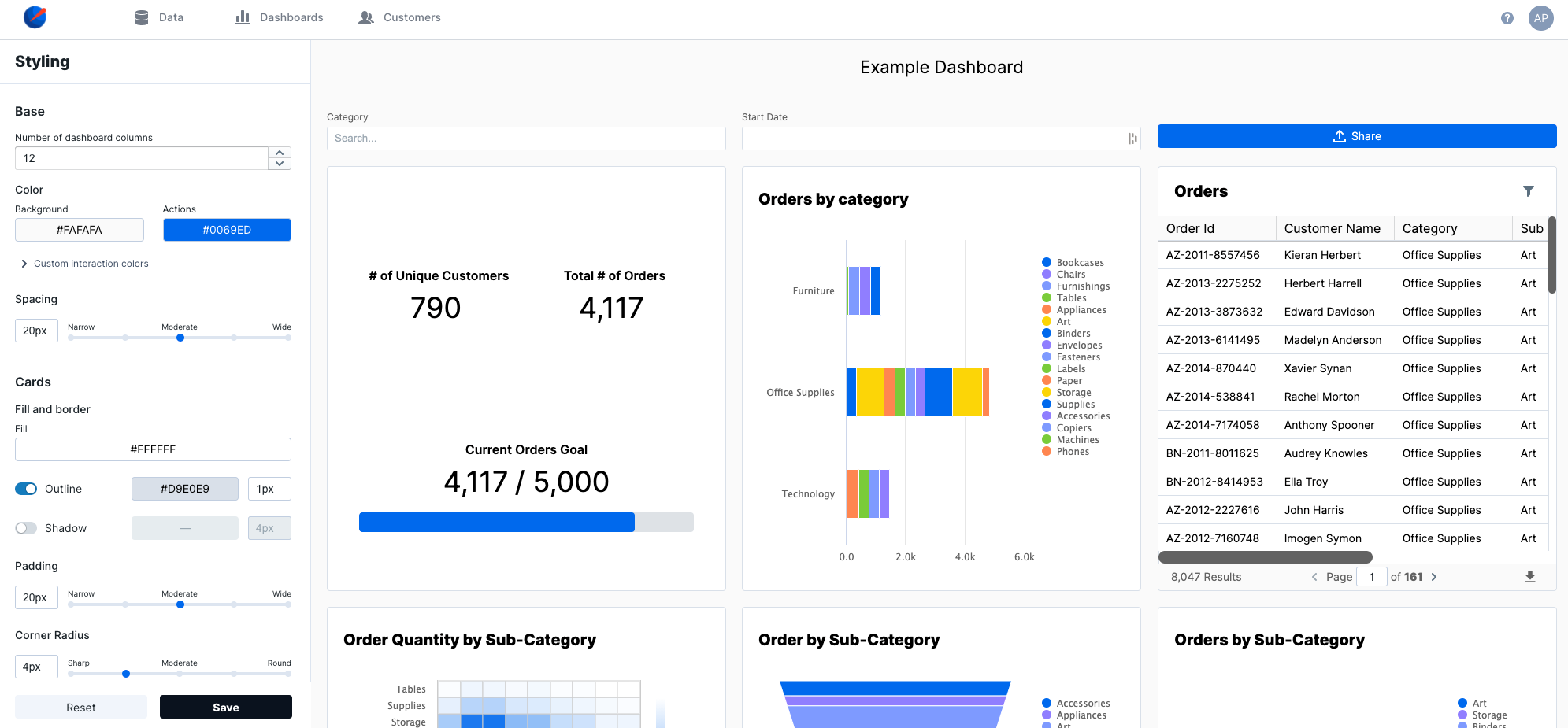
| Number of dashboard columns | The number of columns on the dashboard determines the layouts that can be created. 12 columns provides the greatest flexibility, so we recommend that you don’t change this value unless you have a unique use case.
Default: 12 |
| Background Color | The background color for the dashboard.
Default: #FAFAFA |
| Actions Color | The default color for buttons and input states.
Default: #0069ED |
| Button Color | Overrides the default action color for buttons.
Default: Inherit |
| Interaction States Color | Overrides the default action color for hover interactions (e.g. dropdown input).
Default: Inherit |
| Spacing | The number of pixels between adjacent elements on the dashboard.
Default: |
| Fill | The background color for charts and containers.
Default: #FFFFFF |
| Outline | The border color and width for elements on the dashboard.
Default: Enabled, #D9E0E9, 1px |
| Shadow | The box shadow color and size for elements on the dashboard. A box shadow allows elements to appear a “layer above” the background.
Default: Disabled, #000000, 4px |
| Padding | Interior padding within charts and containers.
Default: 20px |
| Corner Radius | Determines the roundness of the corners of elements on the dashboard.
Default: Inherit |
| Button Corner Radius | Overrides the default corner radius for buttons.
Default: Inherit |
| Primary Text | Font style and color for headings and most body text on the dashboard. Leaving this value as “Inherit” allows the dashboard to inherit the font family from the website in which it’s embedded.
Default: Inherit, #000000 |
| Secondary Text | Font style and color for supporting text and icons (e.g. “download CSV” icon button on the Data Table). Leaving this value as “Inherit” allows the dashboard to inherit the font family from the website in which it’s embedded.
Default: Inherit, #626262 |
| Text Size | The size of body text on the dashboard. Other text sizes are derived from this value as follows:
- Header 1: + 8px
- Header 2: + 6px
- Header 3: + 2px
- Body: + 0px
- Small Heading: - 2px
- Small Body: - 2px
|
| Custom Text Overrides | Custom overrides for the various text types contained in a dashboard. These types are typically used as follows:
- Header 1: Extra large text to communicate a single value (e.g. KPI value)
- Header 2: Chart headings (e.g. Bar chart, Line chart, etc.)
- Header 3: Secondary headings (e.g. heading in date picker modal)
- Body: Most text on the dashboard, such as data table values, dropdown input options, and share button text.
- Small Heading: Chart axis and legend titles
- Small Body: Supporting text, such as chart axis and legend values
|
| Categorical Palette | Default palette for category-based charts (e.g. Bar chart, Pie chart) Good for clear differentiation between categories.
Default: #0069ED, #907EFF, #7E9AFF, #7ACC39, #FF8750, #FCD508 |
| Diverging Palette | Good for data where values fall on one end of a “middle point”.
Default: #7ACC39, #FFFFFF, #0069ED |
| Gradient Palette | Default palette for spectrum-based charts (e.g. Heat map). Good for data that falls on a spectrum or within a range.
Default: #FFFFFF, #0069ED |