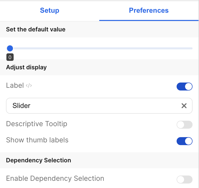
| Label | The is the label that appears on the left side of the slider. It defaults to “Slider”. The toggle allows you to choose whether or not to display this label. |
| Descriptive Tooltip | This can be configured to display a helpful popover to the customer. The toggle allows you to choose whether or not to display the tooltip. |
| Show thumb labels | This allows you to show or hide value labels below each thumb on the slider. |
| Set Default Value | Specify the default values for the thumbs. |
| Enable Dependency Selection | When enabled, you may create a dependency between this element and other elements on the dashboard. When this element is dependent on an element selected, it will be disabled until a value is selected by the user. |
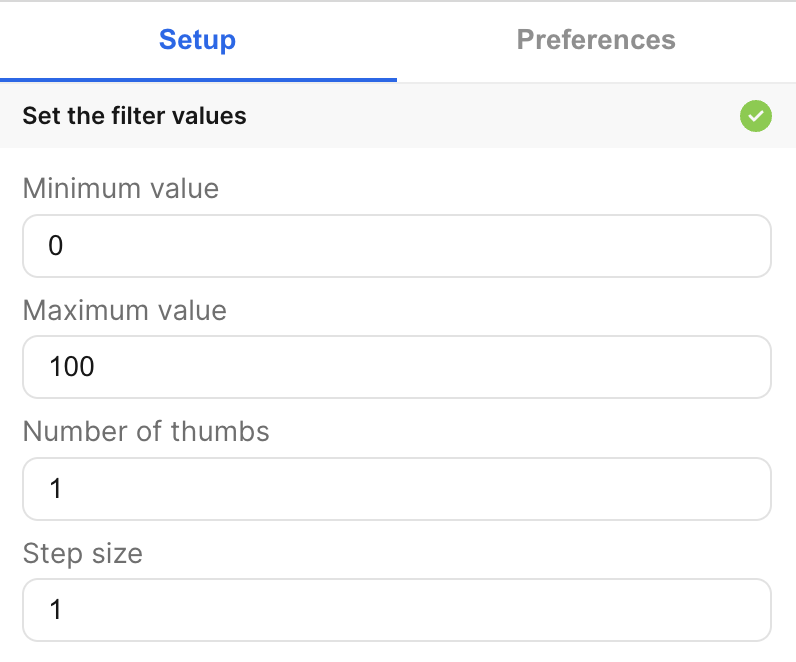
| Minimum value | The minimum (leftmost) value of the slider. |
| Maximum value | The maximum (rightmost) value of the slider. |
| Number of thumbs | The number of thumbs on the slider. |
| Step size | How much each thumb jumps between values. The minimum step size is 1. |