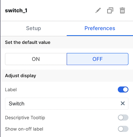
| Label | The is the label that appears on the left side of the switch. It defaults to “Switch”. The toggle allows you to choose whether or not to display this label. |
| Descriptive Tooltip | This can be configured to display a helpful popover to the customer. The toggle allows you to choose whether or not to display the tooltip. |
| On/Off Label | This is the label that appears on the right side of the switch, and it denotes the status of the switch. The toggle allows you to choose whether or not to display this label. |
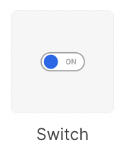
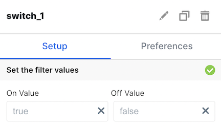
| On/Off Value | This allows you to configure the value of the corresponding variable for this element. The default values are true for On and false for Off. |
| Set Default Value | Specify if default should be on or off |
| Enable Dependency Selection | When enabled, you may create a dependency between this element and other elements on the dashboard. When this element is dependent on an element selected, it will be disabled until a value is selected by the user. |