What it does
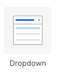
Dropdown
Allows for a user to select a single value from a dropdown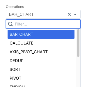
Multiselect
Allows for a user to select multiple values from a dropdown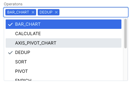
Toggle
Allows for a user to select a single value from a toggle view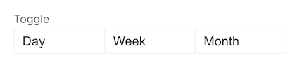
Configuration
Setup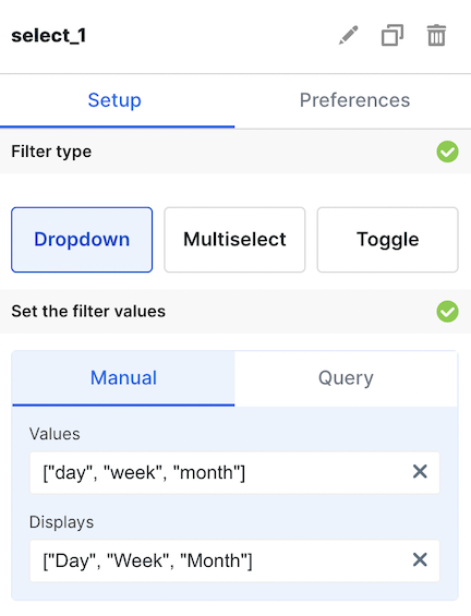
Basic Config
Manual vs. Query
There are two ways to supply options to the dropdown. Manual dropdowns allow you to provide hardcoded values. Query dropdowns allow you to specify the options based on a dataset defined on the dashboard. This is useful for when you want to dynamically populate the dropdown with options from you databaseManual Config
Manual dropdowns are powered by hardcoded lists of strings or numbers. You may provide only aValues list, in which case the values will be use to display
the options.
The Values, Displays, and Default Value fields all take in inputs as javascript.
This means that you must put quotes around strings. For example:Invalid:
[option-1, option-2, option-3]Valid: ["option-1", "option-2", "option-3"]Query Config
Query dropdowns use a dataset to power the contents of the dropdown. You must define the dataset to power the dropdown using the SQL editor on the dashboard editing page.Use the DISTINCT statement in SQL to only pull a distinct list of options for
the dropdown options