What it does
The text input allows you to capture a users text input and configure the dashboard to respond to the inputted text.Configuration
Basic Configuration
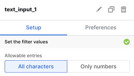
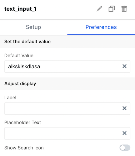
Available by accessing theSetup and Preferences tabs
| Configuration Option | Description |
|---|---|
| Allowable entries | Select between whether a user can input all characters, or just numbers in the textfield |
| Default Value | Set a default value for the text input available on load |
| Label | This label appears above the text input and can be configured to describe how the text input should be used. |
| Placeholder Text | This is the message shown in the text input when no input has been written by the user yet. |
| Search Icon | This icon can be toggled on if the text input is being used as a search bar. |
| Enable Dependency Selection | When enabled, you may create a dependency between this element and other elements on the dashboard. When this element is dependent on an element selected, it will be disabled until a value is selected by the user. |