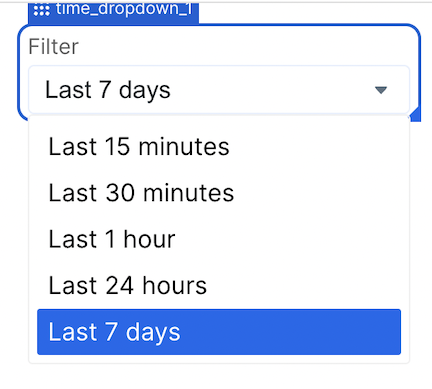
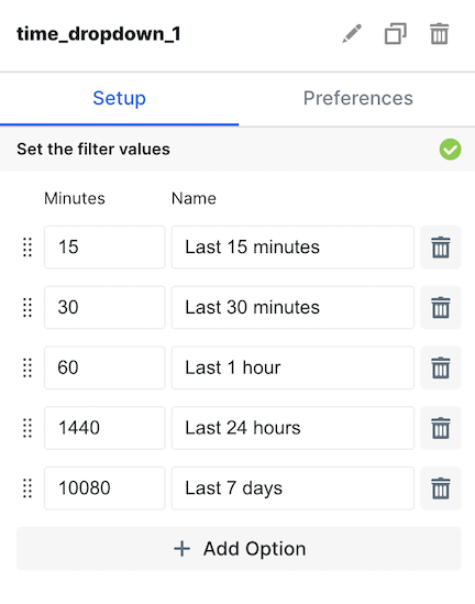
| Set Filter Values | In this section, you can add and reorder options your users can select from. You choose the name of the value (ex. Last 7 days) and the minutes that represents (ex. 10,080). |
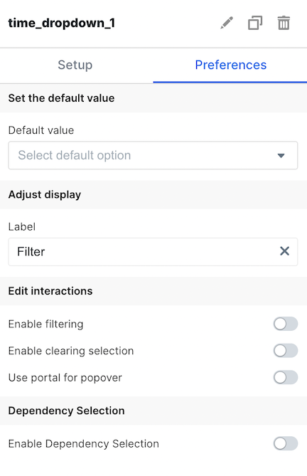
| Default Value | Set the default selection for the Time Dropdown |
| Label | Set the label your users see for the dropdown |
| Enable Filtering | Allow your users to search within the dropdown for values |
| Enable Clearing Selection | Allow your users to clear the dropdown with an X |
| Use Portal for Popover | When enabled, prevents the dropdown options from being hidden when overflowing. Applicable to both overflow from a container and the embed component itself. |
| Enable Dependency Selection | When enabled, you may create a dependency between this element and other elements on the dashboard. When this element is dependent on an element selected, it will be disabled until a value is selected by the user. |