Overview
Data Configuration
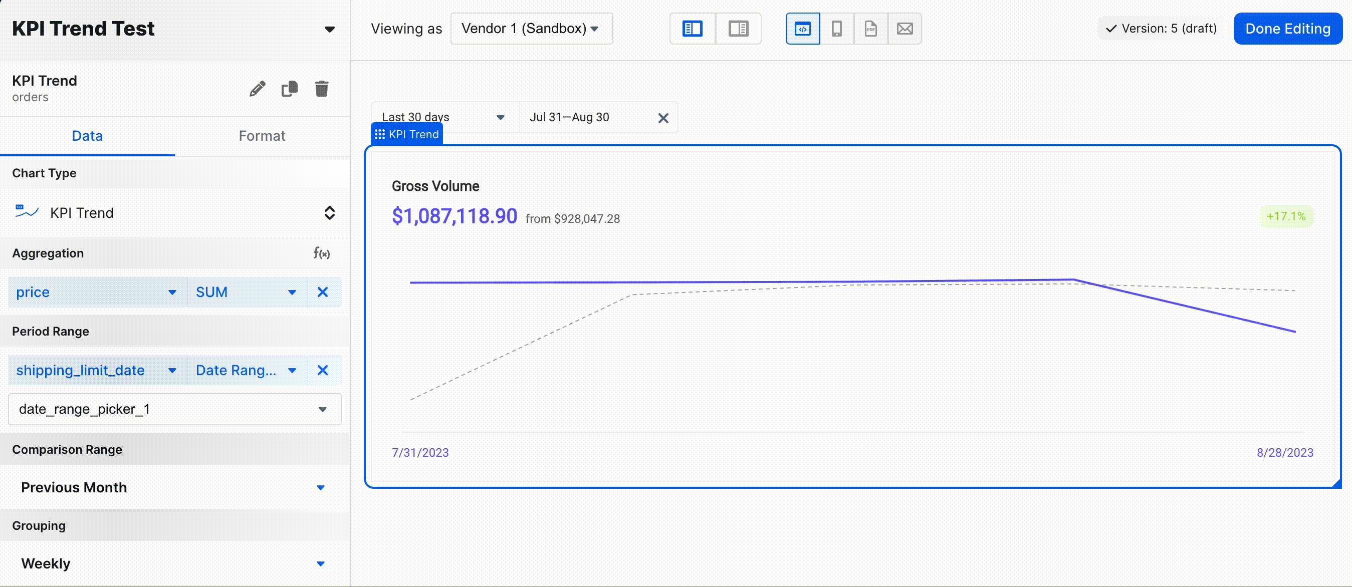
Chart Type
You can read about this section here.Aggregation
This section is for the field you wish to aggregate for the KPI Trend.Period Range
This section is for the period over which you wish to view the aggregation. There are a variety of acceptable inputs for this field.- Preset Values (the examples assume today is 8/15/2023):
- Today
8/15 - 8/15
- Last 7 days
- Goes back 6 days, creating a 7 day period including today
8/9 - 8/15
- Last 4 weeks
- Goes back 27 days, creating a 28 day period including today
7/19 - 8/15
- Last 3 months
- Goes back 3 months
5/16 - 8/15- Note that this will create a period of ~90 days, but can vary depending on the lengths of months
- If the day 3 months ago doesn’t exist, it uses the end of the month
- 3 months before 5/30 resolves to 2/28
- Last 12 months
- Goes back 12 months
8/16/2022 - 8/15/2023- If the day that is “last 12 months” ago doesn’t exist, it uses the end of the month
- Last 12 months for 2/29 resolves to 2/28 on a non-leap year
- Month to date
- Beginning of month to EOD
8/1 - 8/15
- Year to date
- Beginning of year to EOD
1/1 - 8/15
- Previous month
- Previous completed month
7/1 - 7/31
- Today
- Custom Hardcoded Value:
- Custom Range
- You can select a specific start date and end date for this period.
- Custom Range Variables:
- You can specify a set of variables to be used for the start and end date for this period.
- The format of these variables should follow the standard Explo variable syntax, e.g.
{{ start_date }} - The date format is ISO 8601, like
2024-04-24T10:30:00.000Z.
- For custom inputs, we just treat the period as a raw number of days, the nuances around end date above in the
Preset Valuessection still apply, and then we just subtract the length to get the period length. - For time periods, the same rules apply, but the end date of a previous period is the second before the start date. So 12:00-12:30 is compared against 11:29-11:59.
- Custom Range
- Dashboard Inputs:
- You can link some UI elements to populate this period, allowing end users to specify the period they are interested in. These UI elements must have default values in order to be usable as inputs in this section.
- Date Range Input
- Pre-set dropdown options
- The analogous options to the KPI Trend Config Panel’s
Preset Valuesapply here - For the below examples, let’s assume today is
8/15/2023 - Week to Date
- Beginning of week (starting on Monday) to EOD
8/14 - 8/15
- Quarter to Date
- Beginning of quarter to EOD
7/1 - 8/15
- Previous Week
- Last completed week, ranging from Monday to EOD Sunday
8/7 - 8/13
- Previous Quarter
- Full quarter
4/1 - 6/30
- Previous Year
- Full year
1/1 - 12/31
- Last 30 Days
- Goes back 29 days, creating a 30 day period including today
7/16 - 8/15
- Last 6 Months
- Goes back 6 months, the same logic as Last 3 Months applies
2/16 - 8/15
- Last 12 Complete Weeks
5/22 - 8/13
- Last 3 Complete Months
5/1 - 7/31
- Last 6 Complete Months
2/1 - 7/31
- Last 12 Complete Months
8/1/2022 - 7/31/2023
- Year to Last Completed Month
1/1 - 7/31
- The analogous options to the KPI Trend Config Panel’s
- Pre-set dropdown options
- Time Period Dropdown
- The available options and the date offsets should be clear
Comparison Range
This section specifies the comparison period that will be displayed as a line in a secondary color on the trend chart. SelectingPrevious Period will apply a range based on the length of the Period Range. For example, if the Previous
Range is Last 12 months, the comparison range will be 12 months. The date ranges at the top right and top left corners
of the chart should differ by the length specified in the comparison range.
The length of the comparison range will ALWAYS be the same as the length of the current range. The main behavior to note is how the end date of the comparison period is calculated:
- Previous Period - always one day before the current period start date
- The start date is then calculated as end date minus the period length
- Previous Month - the same numerical day, but offset a month. In cases where the comparison month is shorter, take the last day of the month
- e.g. March 31, 30, 29, and 28 compared to previous month all resolve to 2/28 (on a non leap year)
- Previous Year - the same numerical day, but offset a year
- For 2/29 on a non leap year, this resolves to 2/28
The beginning of the week starts on Monday.
8/15/2023.
Period Range:
- Today -
8/15 - 8/15- Previous Period -
8/14 - 8/14 - Previous Month -
7/15 - 7/15 - Previous Year -
8/15/2022 - 8/15/2022
- Previous Period -
- Last 7 days -
8/9 - 8/15- Previous Period -
8/2 - 8/8 - Previous Month -
7/9 - 7/15 - Previous Year -
8/9/2022 - 8/15/2022
- Previous Period -
- Last 4 weeks -
7/19 - 8/15- Previous Period -
6/21 - 7/18 - Previous Month -
6/18 - 7/15 - Previous Year -
7/19/2022 - 8/15/2022
- Previous Period -
- Last 3 months -
5/16 - 8/15- Previous Period -
2/13 - 5/15 - Previous Month -
4/15 - 7/15 - Previous Year -
5/16/2022 - 8/15/2022
- Previous Period -
- Last 12 months -
8/16/2022 - 8/15/2023- Previous Period -
8/16/2021 - 8/15/2022 - Previous Month -
7/16/2022 - 7/15/2023 - Previous Year -
8/16/2021 - 8/15/2022
- Previous Period -
- Month to date -
8/1 - 8/15- Previous Period -
7/17 - 7/31 - Previous Month -
7/1 - 7/15 - Previous Year -
8/1/2022 - 8/15/2022
- Previous Period -
- Year to date - 1/1 - 8/15
- Previous Period -
5/19/2022 - 12/31/2022 - Previous Month -
12/1/2022 - 7/15/2023 - Previous Year -
1/1/2022 - 8/15/2022
- Previous Period -
- Previous month -
7/1 - 7/31- Previous Period -
5/31 - 6/30 - Previous Month -
5/31 - 6/30 - Previous Year -
7/1/2022 - 7/31/2022
- Previous Period -
Grouping
This section specifies the length of the groups on the X Axis. The aggregation will be calculated based on the group. The options for this section are: Hourly, Daily, Weekly, Monthy, Yearly.Filter
Read about theFilter section here.
Formatting
Header
Read about theHeader section here.
General
This section only applies when
Hide Trend Lines is toggled on.- Subtitle: This subtitle will appear below the title of the KPI.
- Title Alignment: This section specifies horizontal alignment for the title of this KPI.
Value
Read about theValue section here.
Trend
- Hide Trend Lines: Hiding the trend lines will turn this visualization into a simplified metric with no line graph. This metric will be similar to a normal KPI, but there will be trend change value below the KPI.
- Main Trend Color: This specifies the color of the line corresponding to the aggregation values in the
Period Range. - Comparison Trend Color: This specifies the color of the comparison line.
- Trend Decimal Places (trend lines hidden): This specifies the number of decimal places in the KPI value.
- Show Absolute Trend Change (trend lines hidden): This specifies if the trend change is a percentage or absolute number. By default, the trend change will be a percentage.
- Use Trend Tag Format (trend lines hidden): This specifies that the trend change value will have a background color matching the trend change color. By default, this is turned off.
- Reverse Trend Label Colors: This switches the trend change tag colors. Positive changes will be red and negative changes will be green.
URL Link
Read about theURL Link section here.
No Data Configuration
Read about theNo Data Configuration section here.
Expose Underlying Data
Read about theExpose Underlying Data section here.